top of page
Top
Headspace

With COVID-19 taking a toll on public mental health, I wanted to see how one of my favorite emotional wellness apps, Headspace, could be improved.
Duration: 12 weeks (2020)
Team: Solo redesign passion project
Role: UX Design, Motion Design, UX Writing
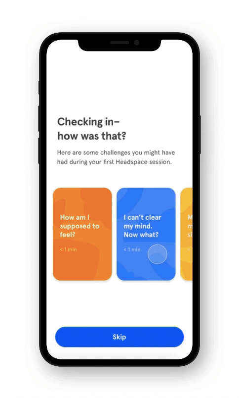
A feature suggestion for the meditation app
The business context
I came upon some interesting data online about Headspace's retention numbers:
-
New users drop off significantly at week 2.
-
But those who make it to week 2 are 5x more likely to convert to a paid subscription. (Source)

User research
Why were users leaving? I interviewed:
-
6 users who used Headspace for <1 week before stopping.
-
2 regular Headspace users.
The biggest takeaways:
-
Most new Headspace users are beginners to meditation.
-
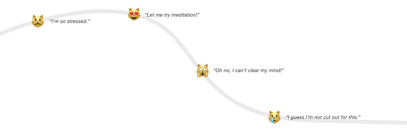
For beginners, high expectations and misconceptions pave the way for frustration. For example, users believe they need to "clear their minds" to meditate and get frustrated when they can't.
-
Even despite negative experiences, users really want meditation to work and might try again a couple times before succumbing to frustration.
Why a user might leave Headspace, at each level of meditation expertise:


The problem
For beginners (most new users), meditation is often harder than expected, and users leave discouraged. It's one reason for a drop in early retention, a leading indicator for paid plan conversions.
The insight
A broken moment in onboarding
Even after users complete their first meditation, they're often left with (unaddressed) questions, experiences, and feelings. Unlike Headspace currently treats it, onboarding doesn't just end after the user taps "start."
Current flow - first time using Headspace

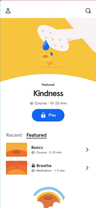
Current solution
How does Headspace currently help users through the challenges of meditation?
Headspace has a help section labeled “Techniques & Support” on the “Meditate” tab which houses 5-10 minute advice recordings for issues like “Restlessness,” “Worry,” and “Motivation.”
Insights from user research:
❌ Discoverability - Many users who would benefit from this help don’t know about it (but are enthusiastic once they find out!)
❌ Scannability - Users found the advice helpful and encouraging, but skipped around or felt the need to “set aside” time to listen.
1) Access "Techniques & Support" from the "Meditate" tab
How might we...?
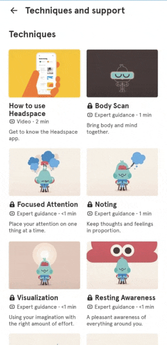
2) Browse help library of help content

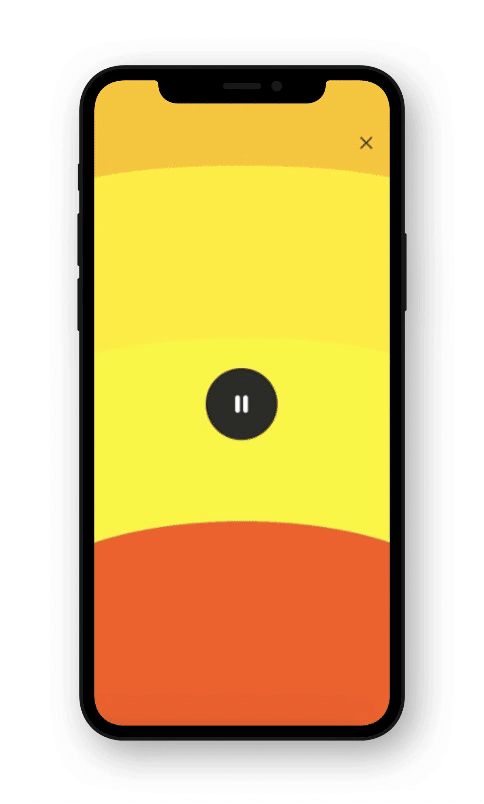
3) Play 5-10 minute advice audio
How might we intercept users' reactions to meditation and help those who are struggling?
Primary goals:
⭐️ Empathize - make room for less-than-perfect experiences - users should feel that their struggle is understood and supported.
⭐️ Empower - normalize & reframe challenges, give actionable advice to encourage users to keep meditating.
Secondary goals:
✅ Accessibility - Surfacing help at the right time and place in the user journey.
✅ Scannability - Making the help quick and easy to digest.
Business goals:
📈 Retention - Increase week 2 retention (new users meditating into week 2), which is a leading indicator for paid plan conversions.
My hypothesis
A quick help/check-in feature after the first meditation as a part of onboarding will 1) meet strugging users where they are 2) guide them through challenges/frustrations and 3) help them to stick with meditation for longer.


Sketches/ brainstorming
Important design/information architecture questions:
-
How do we determine if the user is struggling? What dimensions of the user experience do we measure?
-
What are the most relevant/common challenges that users face?
-
How do we convey help without being intrusive/breaking flow?

Testing prototypes
I tested 6 prototypes, evolving the design based on what I learned:
-
User input: Users found the "survey"/"quiz" feedback format intrusive, prefer to see list of help topics up front since it doesn't ask anything of them.
-
Content format: Users found the "story" content format "engaging" and even "fun."
-
Information length/density: Surprisingly, even with 8+ screens to tap through, users didn't feel like it was too long since each screen is short.
-
Copy/language: Steer away from language invoking "goals" or "success" because it "freaks" users out.
-
Hierarchy: Users prefer seeing a few top help topics rather than a hierarchical list.
-
Flow: I tested the design with non-target users (users who didn't have any trouble meditating) and it didn't break flow for them because it was easily skippable.
Below: a flow that I tested.

Hifi + Motion
Seamless transition from end of meditation to beginning of Check-In/Help feature.
I animated the interaction in Principle. Here are some key moments:
Story slides up, words fade in. Track story progression and tap forward anytime
Add recommended meditations directly to homepage in a fun, easy way.
Final flow
A pared-down version of the key flow without edge cases
Outcomes
How this design perform on my primary goals to make discouraged users feel understood and empower them to keep meditating? I surveyed 5 users to find out.
User quotes:
"I feel heard, like this is just what I was thinking."
"This is reassuring."
"I feel comforted."
My experience is understood and supported by Headspace

I’m confident in my ability to make progress with meditation

How this design perform on my secondary goals to make help more accessible and scannable?
-
All beginners now get exposure to help in the new flow without having to go digging. I'd love to get data on click-through rates.
-
80% reduction in average time taken to go through help content, from 5+ minutes down to <1 minute
This is good signal, and it’s my hypothesis that this will make users more likely to meditate more often. Next steps would involve A/B testing to validate this.
If I were in a position to ship, the main metrics I’d look at would be:
-
week 2 retention
-
total meditation sessions and
-
total meditation time
among cohorts of new users.
Learnings & next steps
When designing for behavior change, I learned that it's not enough to change what people do on the surface level of your interface — you have to change how people think and what they believe (often about themselves).
Some things I'd like to explore next:
-
Integrating this flow with the existing help section
-
Real world analytics
-
The role of community in skill-learning/habit-building
A question to ponder: working with a small research sample size got me thinking about the role of logic vs intuition in design. How do we keep the magic while avoiding bias?
Thanks for reading! Back to top ↑
bottom of page